 (Image by barbara_nixon)
How to Design & Deliver Your Presentations using PowerPoints That Sizzle!
I have been presenting for many years (formally and informally), and have gone into coaching for awhile. Many people ask me what is the best for of presenting to grab the audience attention and to achieve the end results that we aim for.
My answer is: " Every form of presentation has its own merits and downsides, but all can be used to achieve your final aim. The most important thing is to determine your group audience and the purpose of your presentations. For coaching sessions where i want my students to absorb faster and more effectively, i would use Flip-Charts and Whiteboards. But for generating ideas across to the audience where visuals are very important - i will use PowerPoint Presentations."
We all heard of Winston Churchill and Lincoln Abraham. Both are great Motivational Speakers and Leaders.
As speakers, both practice the three-part rule of classic rhetoric Presentation Formulae:
1. Start with an attention-grabbing introduction. I personally prefer Outrageous Openings.
2. Use the body of your speech to deliver persuasive content. Over here, this is where i show my expertise to the audience.
3. Finish on a strong note with a call to action.
Great presenters would have had to learn to think like director Steven Spielberg and John Woo. They are both masters of the big screen because they both understands how to tell a great story with pictures and dialogues.
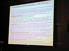
PowerPoint does some things spectacularly well, & some things much less well. As an economical easy-to-use visual persuader, it is unequaled. The problem is, unskilled presenters use PowerPoints ability to quickly produce text slides drown many of us in a tidal wave of bullet text (perhaps with a few diagrams here and there). It seems like many educational centres and schools are using PowerPoints to teach these days and students are having many "bullet-phobia". Many have complaint of falling asleep while their teachers can reading those bullet points non-stop. This is especially true when those slides are full of words in it (just look at the image above).
PowerPoints presenters have to also cope with limitations imposed by the way our brain works. Our short-term memory can only hold a very limited amount of information at one time. The brain processes presentations through 2 channels, a visual channel and an auditory channel. Overload one or both of these channels and you have overloads. We have all witnessed the symptoms called Audience Start Suffering from Mine Eyes Glaze Over (MEGO) symdrome.
Let's be more effective and efficient in shaping mission-critical presentations for success of our students which is our future champions. They won't learn well with loads of "boring-bullets" flying towards them.
No comments:
Post a Comment